How few screens can a booking take?
· Design experiment · 5 min read
On this page · 11 sections
I design and build TicketingHub's booking widget. Tour and attraction businesses put it on their websites to sell tickets.
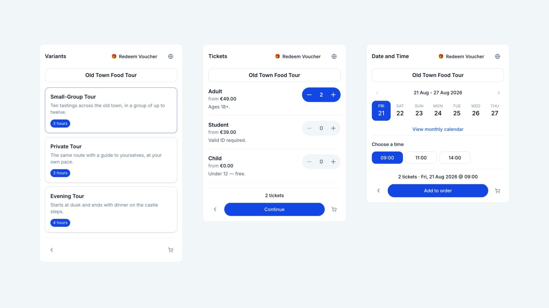
A booking in it can take nine screens: Products, Variants, Tickets, Date and Time, Questions, Extras, Basket, Customer Details, Payment. Not every widget has all nine. It depends on how the supplier set it up. The old widget had even more. The new one got simpler, but it kept the steps.
The steps are the pain. Here is the widget I would build with no limits: one screen for the main decisions.
Fewer steps make a happier customer. That is my conclusion, not a result. I have not tested it.
Where the steps came from
TicketingHub serves many industries. Features kept coming, to satisfy every kind of supplier. The dashboard got harder to understand. The widget got harder to set up.
Every feature became one more thing on every step: a settings button, the product name, Redeem Voucher, Buy as a gift. Most of them are not worth their space.
The frontend push calmed it down. It is still busy, when the only goal is to reach the checkout.
What I would judge it by
Clicks to payment, conversion, and the height of the embed. Only the height can be measured today.
Variants
Old Town Food Tour
Small-Group Tour
Ten tastings across the old town, in a group of up to twelve.
Private Tour
The same route with a guide to yourselves, at your own pace.
Evening Tour
Starts at dusk and ends with dinner on the castle steps.
Tickets
Old Town Food Tour
Adult
Ages 18+.
Student
Valid ID required.
Child
Under 12 — free.
Date and Time
Old Town Food Tour
21 Aug - 27 Aug 2026
Choose a time
One panel for the main decisions
Category, tickets, date and time are fields in one panel. Each opens a popover. Three screens become one.
I rejected two other ways. Separate forms kept the choices apart. An accordion was too tall. Fields with popovers are compact and clean, and the panel does not grow.
One ticket is always prefilled. Whoever wants one ticket does nothing. Whoever wants two adds one, not two. A group ticket with a minimum of four starts at four. Everyone saves a click.
Two tickets is the most common order, at 39%. One ticket is 22%. I still start at one. A widget should never put a second ticket in your order for you. Airbnb does the same: its booking panel starts at one guest.
The category takes one of three shapes:
| The product has | The panel shows |
|---|---|
| No categories, or one | No field. A single category has no purpose |
| Two, with short names | A button group. Both visible, one tap |
| Three or more, or long names | A dropdown, one preselected |
Above 22 characters the button group becomes a dropdown. That number is a guess. Nine in ten production names fit in 44 characters.
Research is split. Baymard finds that fields matter more than steps. GOV.UK starts from one question per page. My case: three short choices that depend on each other, with no typing.
The price, not a summary
Today the first exact price shows up in the basket. Tickets says "from". Date and Time shows no price.
Here the line under the product name reads "Add date and time for prices", then the total: "$25.00 for 1 Ticket". The real widget uses that line to repeat tickets, date and time. The fields already show those. What people want to know is what they will pay.
Not seeing the total up front is one of the reasons people abandon a checkout.
What left the screen
Tickets
London Eye
Adult
Ages 16+
Child
Ages 3-15. Must be accompanied by an adult.
Senior
Ages 65+
- The settings button. Language and currency can be detected, or set in the widget's setup.
- The product name card. The name is the title now.
- Redeem Voucher. This view is for suppliers who do not rely on vouchers. If it comes back, it goes into the cart, next to the discount code.
- Back. It only matters when the widget sells several products. In the bottom row it broke up the main button. Now it is a tab on the left edge, outside the layout.
Buttons that are never disabled
Some customers clicked the dead button anyway. Others thought the widget was broken. Nobody told them to choose something first.
So the buttons are always active. Pressed too early, nothing is sent and the missing fields turn red. People make the mistake and learn from it. Adam Silver makes the same case.
The cart is a tunnel
"Add to order" opens a modal. The cart is on the right. The left side is for everything else: questions, extras, combo discounts, details, payment. I think of a cart as a drawer. It should open at any time. Many checkouts work this way.
The modal is a tunnel, a room where the purchase gets finished.
- The screen behind it starts over. Close the modal, and you can add another booking.
- The cart icon pulses once there is an order. The purchase can be picked up at any time.
- "Add more" is gone. The booking screen is right behind the modal.
- An empty cart is a small popup, not a modal.
- The timer sits on the main button. It should carry weight, and it looks interesting there.
- After payment there is no cart. One small card: thank you, the summary, continue shopping.
- "Cart", not "basket". No reason behind it. I would test both.
The objection is real. NN/g says a modal with several steps keeps people from the main task. I am just as open to keeping everything inside the widget. This is what I most want to test. The hardest case is adding a second product from a closed modal. It is also rare: 2.9% of orders hold more than one booking.
Constraints I set aside
- A modal inside an inline embed. The embed is an iframe that follows its content's height. A modal inside it is a real problem. I left it out.
- Tickets, then date, then time. I debated this. Both orders have a logic. Tickets first is the platform's core, and I respected that. Reordering it would be too large a refactor. I would test both.
- Questions and extras. Today they are part of the booking. Moving them into the modal needs a backend decision.
- Only the inline embed. A customer should not need one more click to start. Inline widgets are 39% of the legacy widgets and carry 53% of its orders. That does not prove the embed is why. It is where I would start.
Why it is not built yet: a small team, a long list of requests, and priorities that kept moving.
How the prototype was made
It follows the real widget pixel for pixel. Everything that exists was lifted from its templates, styles and locale files. I built it with Claude Code, reading the widget's code as we went, so the facts here were checked in the code.
What this is not
Nothing here shipped, was tested or was measured. What would prove me wrong: build it, test it, gather the data, iterate. Design is iteration.
Working together
This one is a wish, not a delivery. The widget it starts from is real, and I am its lead designer and frontend developer.
I am open to full-time, part-time and contract work, whether that means joining a product team or taking on a project like this one. Write to hello@edigil.com or use the contact page.